Design review
A deep dive into 85 flows and 300+ screens
I reviewed Heidi directly to understand where trust is already strong, where the experience could become even more coherent, and where design infrastructure could help Heidi scale with one clear hand.

The lens
The principles behind the review
I am looking at Heidi from the outside, without the full product, clinical, technical, commercial, or regulatory context behind every decision. So this is not criticism, and it is not a finished audit. It is a way of showing how I think. I reviewed:
-
Where trust is already strong.
-
Where the product is doing important work.
-
Where design infrastructure could help Heidi scale with even greater coherence.
The spirit is additive: to build on what is working, name the design opportunities I can see, and show the kind of care I would bring to the product from inside the team.
Before reviewing a single screen, I needed a standard to hold them to. These principles are that standard. They aren't generic UX heuristics. They are derived from what Heidi actually is: a product reshaping the smallest units of clinical work, a place where AI and patient data have become new materials for design, and a product where the real thing being designed is trust.
Manifesto
Two human beings are present in every screen. The clinician is overwhelmed, overworked, and, the part that matters most, unable to care as much as they want to. They didn't train for years to document; the system turned giving care into proving it, and the interface became a tax on their attention. The patient is the person inside the record: irreplaceable, reduced to notes and risk factors, hoping to be seen as a whole person. Heidi's job is to collapse the distance between them. Design decides whether the technology returns the clinician's capacity to care, or quietly consumes more of it.
Holding both people at once creates real tension — between speed and safety, assistance and agency, business and trust.
Building principles
Principles
01
Start from the product’s reality
Heidi changes the atomic units of care — a conversation becomes a record, a record becomes a structured object. The material of design has changed, so the principles had to start there.
02
Hold both users at once
Each principle was pressure-tested against two questions: does it protect the patient inside the data, and does it give the clinician back attention, confidence, or time?
03
Separate polish from trust
The principles deliberately avoid taste language. The bar is not “looks good” — it is “behaves consistently when the stakes are high, for a clinician on their worst day.”
04
Resolved heuristics into commitments
Many of the tensions overlapped. Collapsing them into four mutually distinct commitments is itself the argument: finding the shape inside complexity is the job.
Design principles
Four commitments
1 Presence Give the clinician back the room.
The interface was historically a tax on the clinician's attention. The deepest promise of Heidi is to return the clinician's capacity to be present with the patient — not more entangled with the machine. This commitment is about attention and load: every screen should hand capacity back, not consume it.
The principle
Heidi should make the clinician more present with the patient, not more present with the system.
The test
For each element, ask whether it pulls the clinician's eyes toward the patient or toward the system. Knowing what to hide is how you hand attention back.
The principle
The heavy part of the work isn't keystrokes — it's holding everything in their head while documenting, complying, and reconciling.
The test
Don't just count clicks. Ask what the clinician has to remember or worry about on this screen, and whether Heidi could carry it instead. The win is capacity left over for the next patient.
2 Agency The human stays in command of the AI.
An overwhelmed clinician is most at risk of either rubber-stamping AI output or fighting it. The product must support judgment without replacing it — and the AI must be honest enough that trusting it quickly is also trusting it safely. Honesty is how agency is protected.
The principle
The product must support the clinician's judgment without replacing it, and without making staying in control a chore.
The test
Can the clinician see, trust, and correct what the AI did, quickly? If staying in control costs effort, agency becomes another tax.
The principle
A time-pressured clinician will lean on the AI, so it must be clear about what it knows, where it came from, and where assistance stops and judgment must take over.
The test
Wherever AI output appears, check that provenance, certainty, and the assistance/advice boundary are visible. Honesty is what lets the clinician trust the output without re-verifying everything — the only way the time saving is real.
3 Safety Trust is held where it's most likely to break.
Trust isn't built on the happy path. It's built — or lost — in the worst moments, with irreplaceable data, in the first seconds before the product has proven anything. This commitment is about designing for the edges, because that's where a clinician on their worst day actually meets the product.
The principle
A tired clinician at the end of a long day is who actually meets your error, empty, and confirmation states. Consistency exactly there is what earns trust.
The test
Find the worst moment on the screen — failure, latency, ambiguity — and check it's designed with as much care as the best moment. A failure state that assumes a calm user betrays the clinician when they're depleted.
The principle
A lost session is a patient's irreplaceable words, and the clinician is accountable for the record. Recovery, version history, autosave, and undo are how the product shares that weight.
The test
Does this reassure the responsible clinician that the record is safe, constantly and unambiguously? Irreversible actions need proportional friction. The clinician should never wonder whether their work survived.
The principle
The first impression is the clinician deciding whether Heidi is safe, clear, and mature enough to bring into the room — judged with little time and low tolerance for risk.
The test
The most confident interaction on the page should be the thing the clinician needs to do first. If the most confident element is anything else, re-rank the hierarchy.
4 Coherence The product builds trust through coherence.
Coherence at scale shouldn't depend on one team trying harder. It should be a property of the system. This commitment covers the seams between features, the integrity of the product under business pressure, and the governance that lets clinical content be trusted. It's where design stops being screens and becomes infrastructure.
The principle
Built by many, felt as one. Coherence means the clinician learns the product once and trusts it everywhere; fragmentation costs them attention and confidence at every new surface.
The test
Compare each screen to the strongest surface. If the clinician would sense “a different team built this,” the coherent choice wasn't the default — and the cost lands on the user, not the org.
The principle
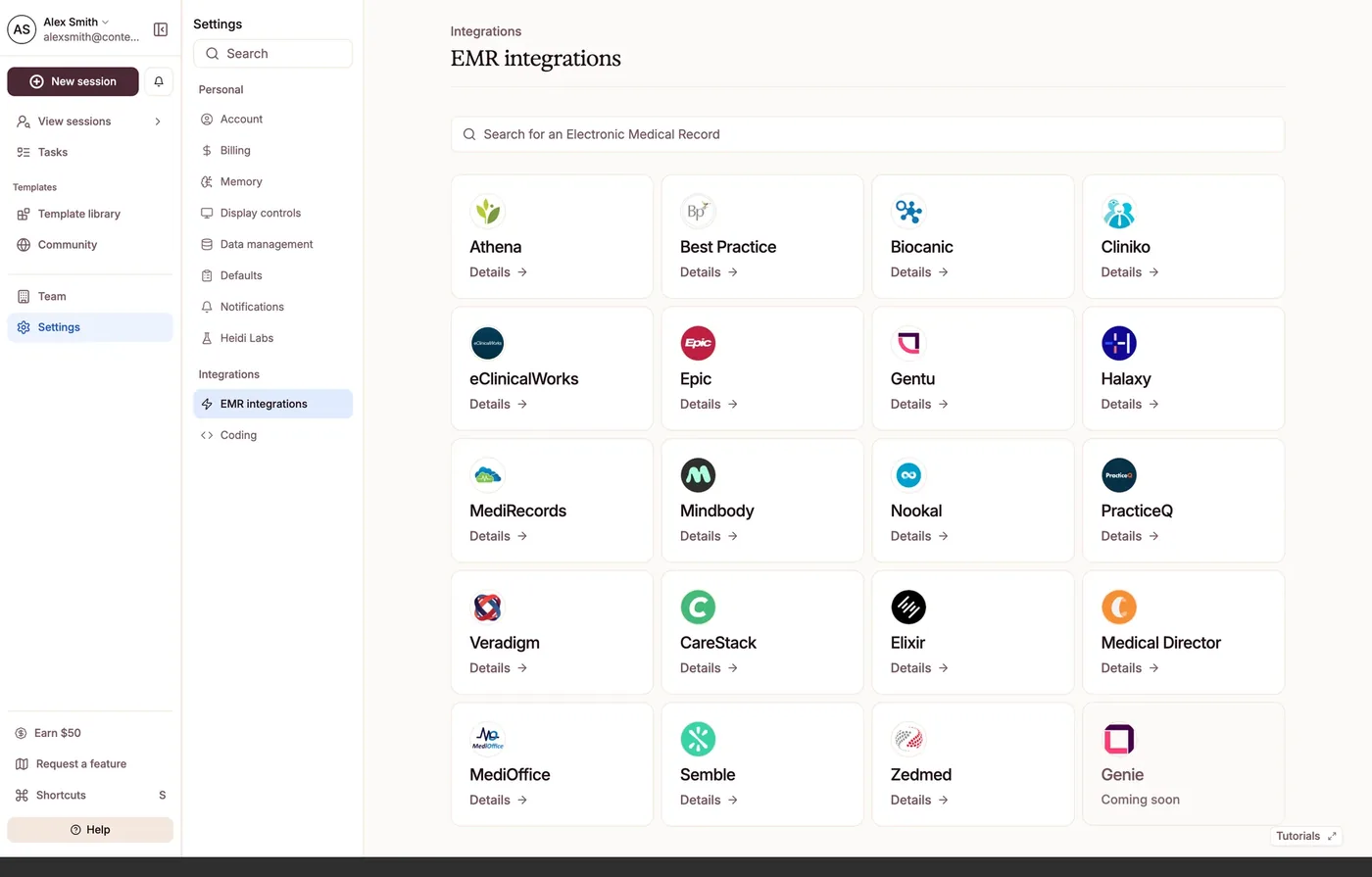
Seams between features, teams, and integrations are where the experience fragments. For a clinician, a broken handoff is a moment they must stop, re-orient, and spend attention they can't spare.
The test
At each transition or integration, check that the clinician's flow and the patient's data are carried with the same care as the core loop. Coherence at the seam shouldn't depend on the clinician compensating for it.
The principle
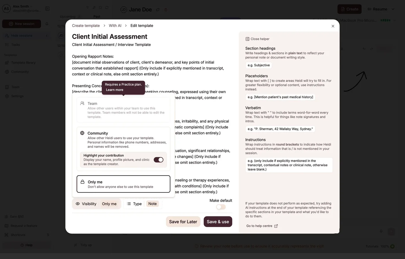
Commerce inside a clinical moment intrudes on the patient and interrupts the clinician's focus, withdrawing from the trust they've extended to the product.
The test
If a screen places commerce or growth mechanics inside a clinical moment, flag it. It steals the presence Commitment 1 is trying to protect.
The principle
Visible provenance, verification, and consent are trust infrastructure. Designed well they reassure the clinician; bolted on they become another interruption in a heavy day.
The test
Where governance shows up, ask whether it makes the responsible clinician more confident, or just slows them down. For clinical content, popularity is not safety — authorship and verification are.
The review
The detailed design review