02 · The core loop · Heidi web
The core loop
Capture, transcription, the note, and Ask Heidi. This is the ninety-five percent: the surface clinicians actually live in, and the one they love.
At a glance
This is the surface clinicians live in, and it shows. The note is clean, multilingual capture is a real edge, the extracted tasks are useful, and the safety guardrails are well judged. Because the product has already earned focus and trust here, the opportunities I see are mostly about protecting that: easing the density, and keeping the moment of care clear of anything that competes with it.
Where first impressions are about trust before the product, the core loop is the product. So the bar is higher, and mostly Heidi clears it. I followed one consultation end to end, holding it to the principles, with the lens that every screen here should hand the clinician's attention back to the patient.
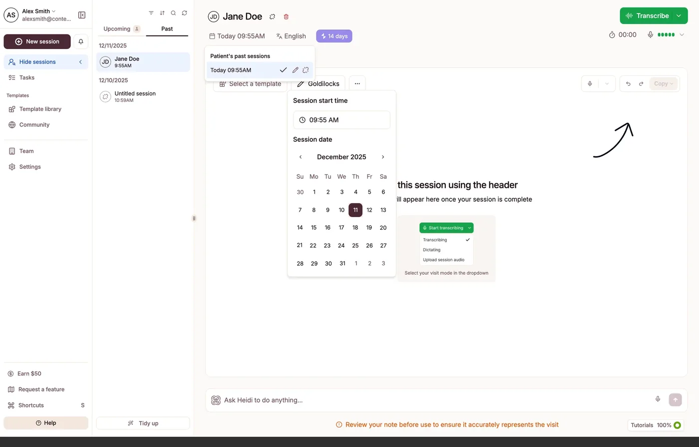
Capture asks a lot before it records
Before the first word, the header carries a patient, a date and time picker, a language pair, a retention pill, a template selector, and a kebab. Some of that matters; much of it could be a sensible default. The impressive part is quiet: capture handles Japanese, English to English without ceremony, an edge over the enterprise incumbents. The canvas a clinician lands on is empty except for a hand-drawn arrow pointing at the Transcribe button, the same arrow I saw at the initial touchpoint.
- The lens
- Give attention back to the room
- What works
- Effortless multilingual capture.
- The opportunity
- The hand-drawn arrow, again.
- What I'd propose
- When the primary action needs an arrow drawn on the screen, that is a signal the layout could carry more of the hierarchy. I'd look for ways to make Transcribe unmistakable by design, and collapse the pre-recording decisions to defaults a clinician can change later, so recording becomes one confident move.
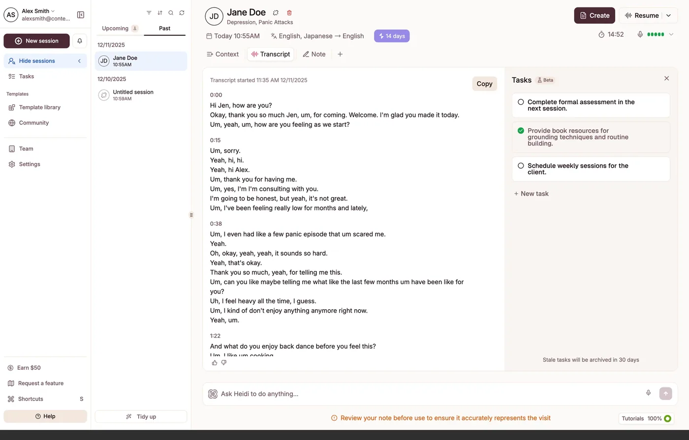
From conversation to action, automatically
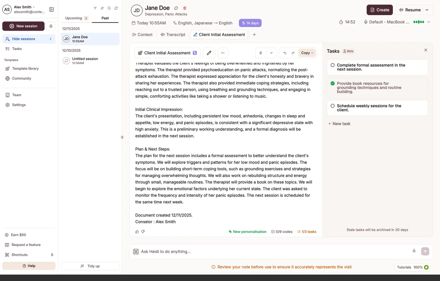
The transcript is clean and speaker-separated, but the strongest idea on the screen is the Tasks panel on the right: Heidi reads the visit and pulls out follow-ups, complete the assessment next session, provide resources, schedule weekly sessions. This is the product living up to its new promise, moving from documentation toward the rest of the clinical day, and carrying load the clinician would otherwise hold in their head. And it sits in a side panel.
- The lens
- Reduce the cost of caring, not just the cost of clicking
- What works
- Tasks extracted from the visit.
- The opportunity
- Three panels competing at once.
- What I'd propose
- I'd give the tasks their due. The shift beyond the note is Heidi's whole strategy; the interface could treat extracted actions as a headline outcome rather than a sidebar. And I'd explore easing the three-panel density, so the note, the transcript, and the tasks do not all ask for attention at once.
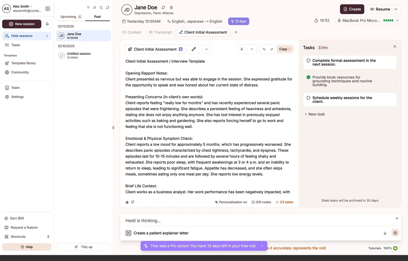
A clean note, and a commercial prompt inside the moment of care
The generated note is good: structured, scannable, sectioned the way a clinician reads. And Ask Heidi to do anything is a confident, simple affordance. Sitting in that same bar, in Pro purple, is a prompt to create a patient explainer letter. This is the surface a clinician reaches for mid-visit, and the note landing is a small moment of relief, so a sell placed right here is double-edged: it converts precisely because the clinician's guard is down. The product has earned a high degree of focus and trust at exactly this moment, and I'd be careful about spending it.
- The lens
- Keep commerce out of the moment of care
- What works
- Clean, readable note.
- The opportunity
- Upselling at a moment of relief, a double-edged sword.
- What I'd propose
- Make it subtler and less commercial. Show the Pro action as a quiet label in the moment rather than a prompt, and surface the entitlement at the edge, something like 13 days of Pro left, in purple at the top. The clinician stays aware of Pro without the moment of relief turning into a sell.
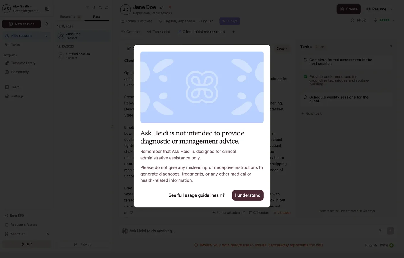
The guardrail is well judged, and a little heavy
Before Ask Heidi will help, it draws a clear line: administrative assistance only, not diagnosis or management advice. For a product handling clinical decisions, this is exactly the right instinct, and one of the most important things the interface does, the designed boundary between assistance and advice. Most competitors are not this careful. The one opportunity is weight: a full-screen modal to deliver one principle interrupts the flow it is trying to protect.
- The lens
- Make the AI honest, so the clinician can move fast safely
- What works
- A genuine, well-judged safety line.
- The opportunity
- A full modal for one sentence.
- What I'd propose
- Keep the principle, lighten the delivery. I'd say it once, inline, the first time Ask Heidi is used, with the full guidelines a click away. Safety and flow are not opposed; good design holds both.
Where I'd start
- 01
Protect the moment of care. Keep the Ask Heidi bar a clean tool when a clinician is with a patient, and move commercial prompts to surfaces outside the visit.
- 02
Retire the hand-drawn arrow. It appears at the initial touchpoint and again here. A recurring crutch for the primary action is a systemic hierarchy opportunity, not a one-off.
- 03
Promote the tasks. Extracted follow-ups are the move beyond the note. I'd treat them as an outcome, not a sidebar.
The core loop is where one team's craft is highest, and it shows. So the work here is less to fix than to preserve: keep the quiet confidence of this surface as the product grows, and the rest of the product has a bar to reach for.
The review
The detailed design review