06 · The system · Heidi web
The system
The job description's hardest line: make the product feel like the work of one person. So here is that question, read across the whole product, not one flow.
At a glance
Close at the core, with a clear path across the rest. Heidi already feels like one person's work inside any surface one team owns. At the boundaries between teams it feels like several hands. That is not a taste problem; it is the natural moment to make coherence a property of the system rather than something individual discipline has to carry.
The same product, two hands
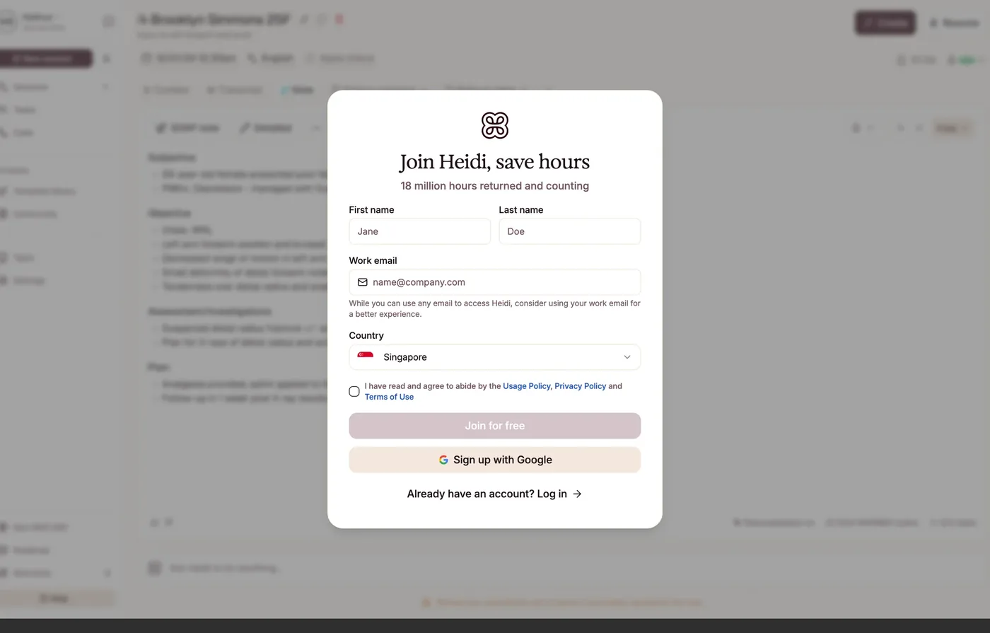
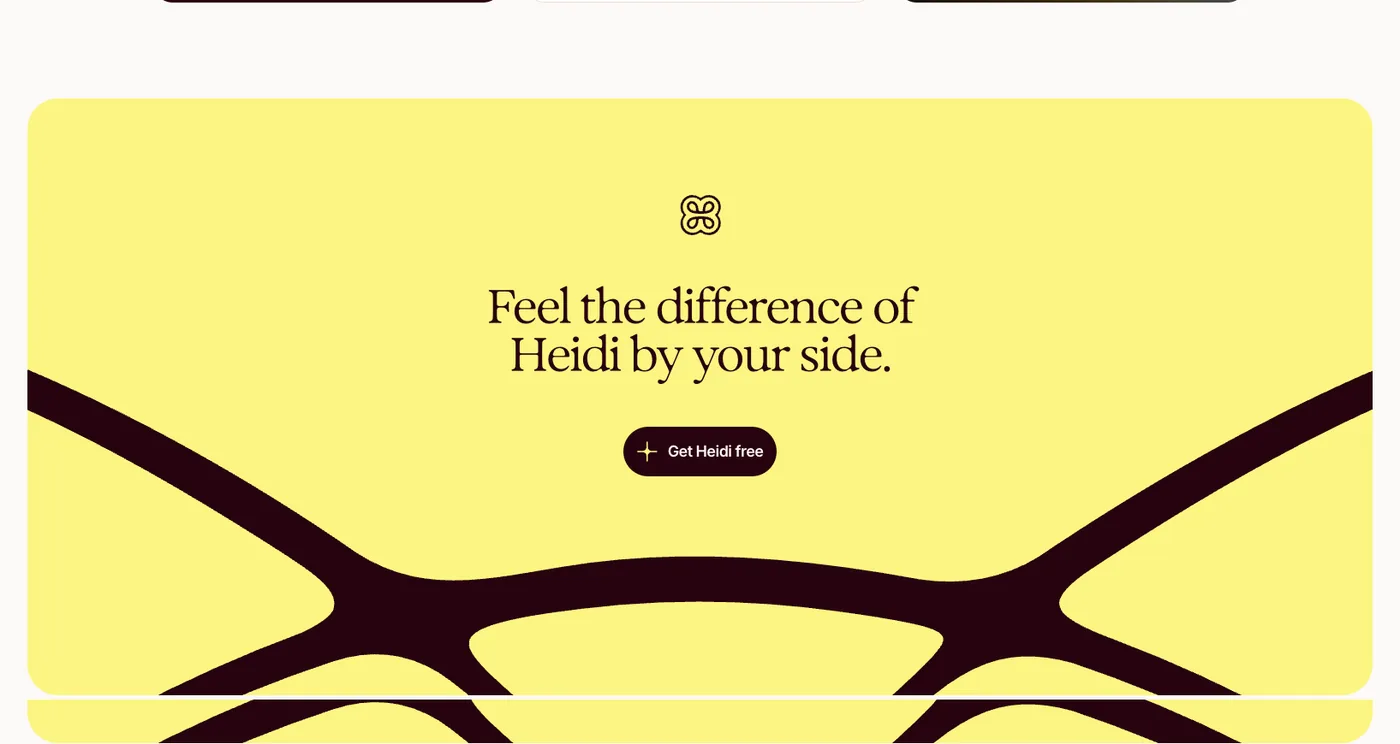
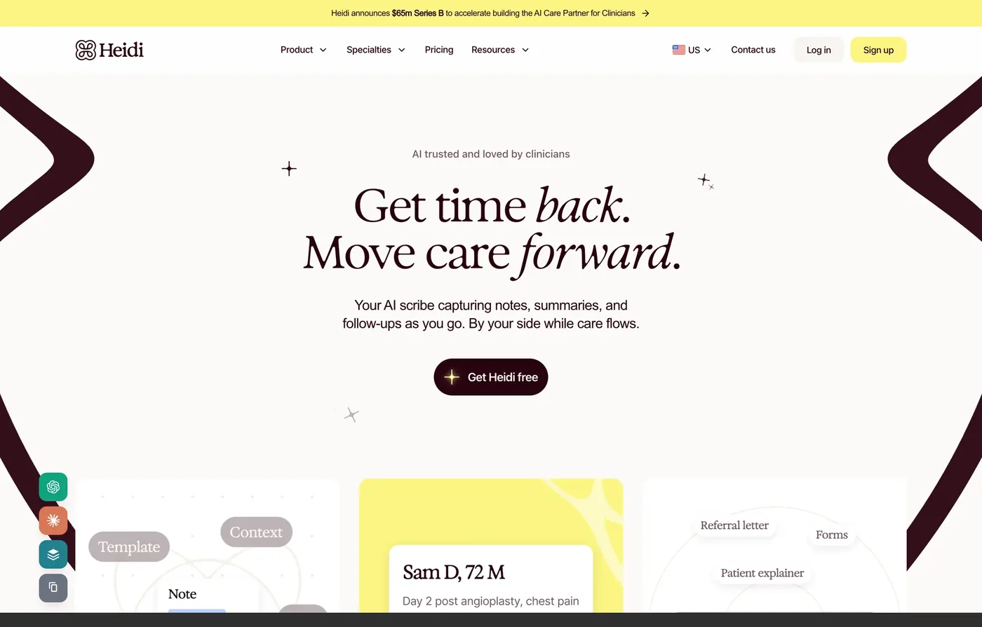
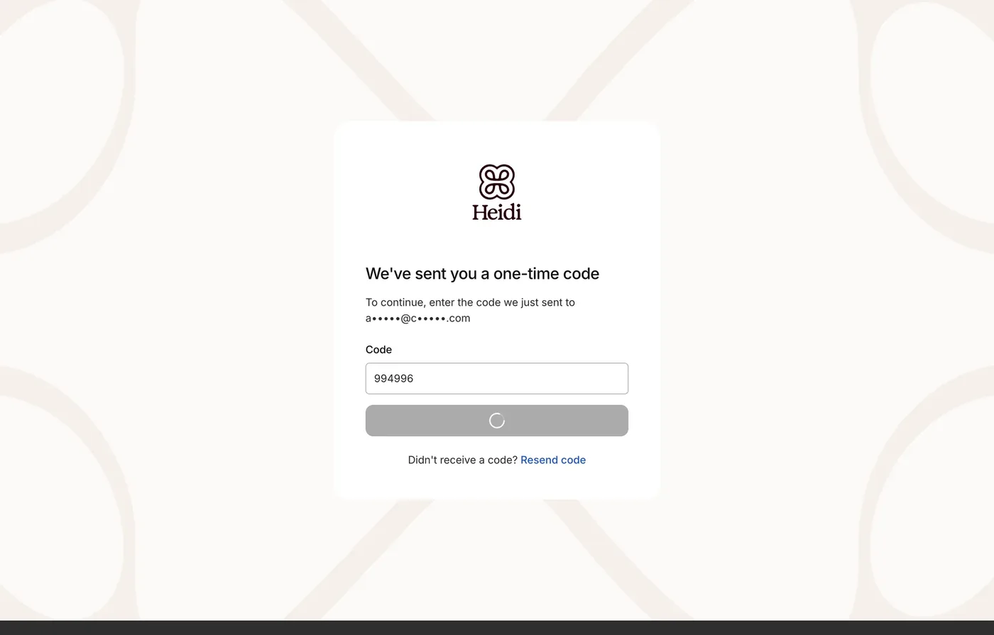
Put the two extremes side by side. The promise, in full voice. The verification screen, moments later, in none. Nothing here is badly made. They are simply not yet made by the same hand, and a clinician feels that even if they could never name it. This is the seam the system can close.
Consistency, read across the product
-
Voice & typography
Strong at the coreThe Exposure serif and warm sand-and-oxblood world are distinctive and confident wherever one team owns the surface, the marketing site and the app. At the seams, auth and verification, it drops to a system sans with no voice. The same product, in two hands, and a chance to bring the seams into the system.
-
Colour & accent
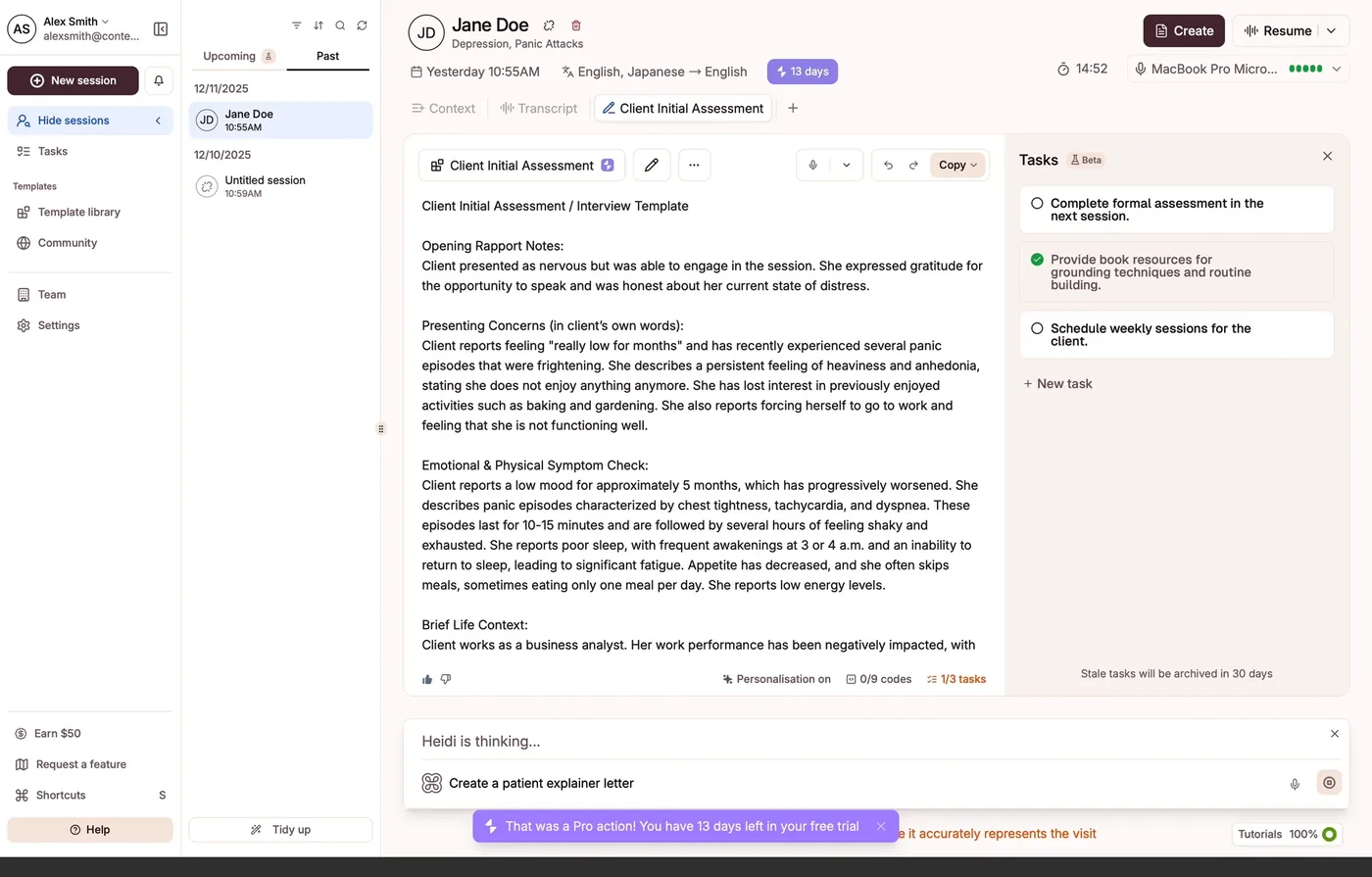
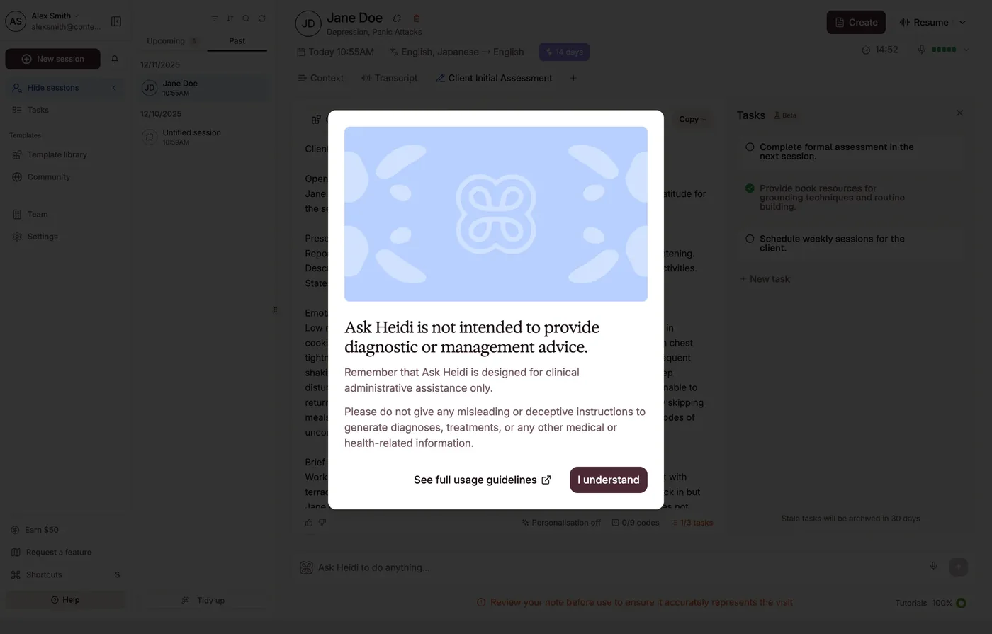
Mostly disciplinedSand, oxblood, forest, and sunlight are used with restraint. A few stray accents slip in: a bright blue link on the one-time-code screen, Pro purple inside the assistant. An accent should mean something, so the opportunity is to let palette signal one product rather than which team shipped a screen.
-
Hierarchy
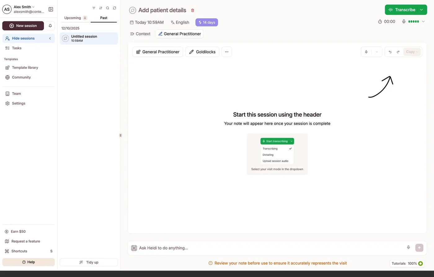
A growth edgeThe hand-drawn arrow appears at the initial touchpoint and again in the core loop, pointing at the primary action. When the interface draws on itself to direct attention, that is a signal the layout could carry more of the hierarchy. It is the clearest single place the system could do more of the work.
-
Density
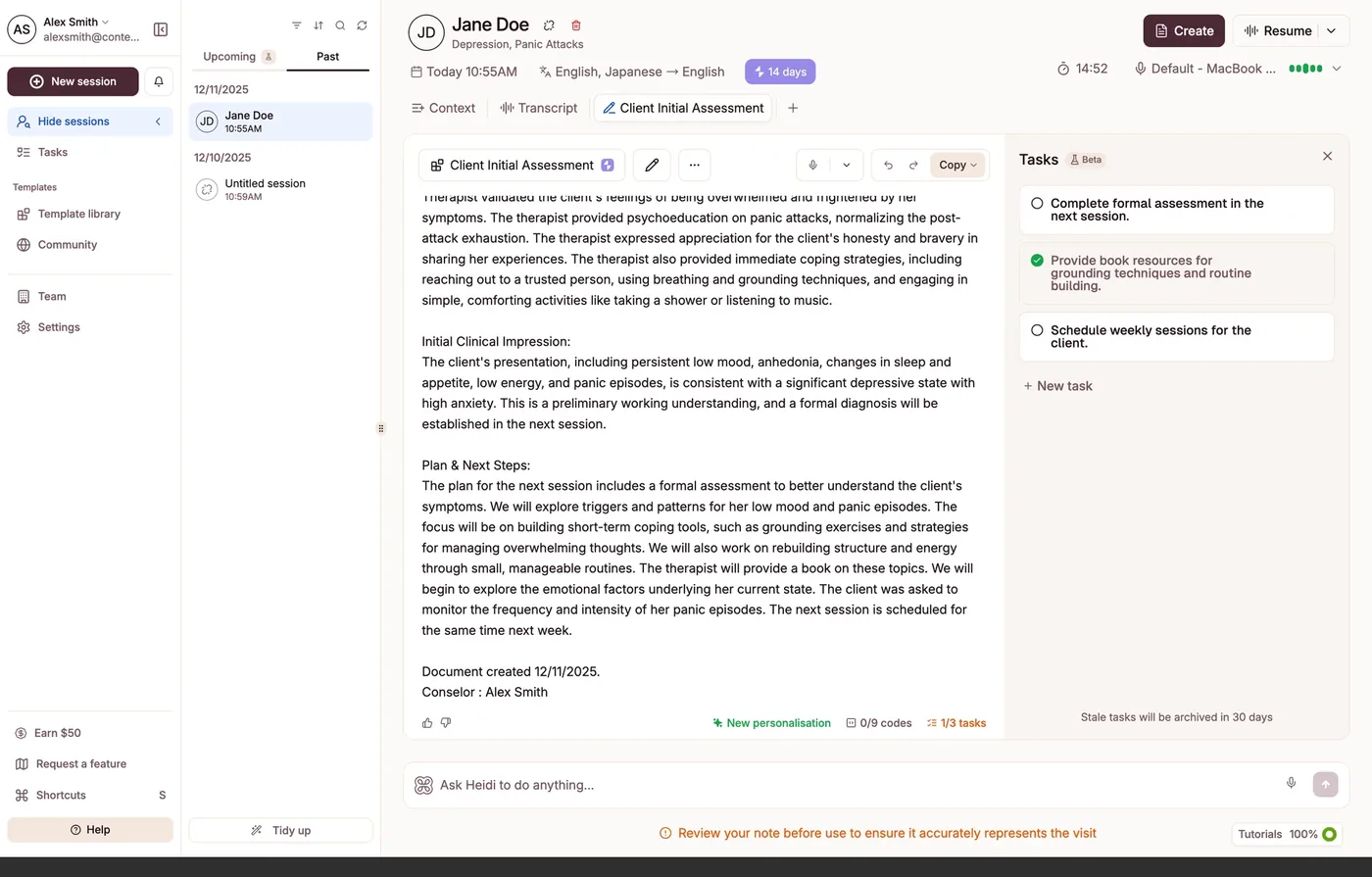
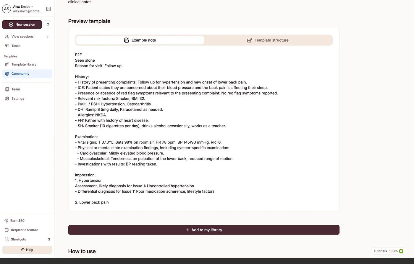
Power, ahead of restraintThree-panel layouts and an eleven-item rail from the first session. The capability is real and the control is welcome to power users; the opportunity is to ask less of every clinician at once, especially at the moments that should be simplest.
-
Destructive actions & trust
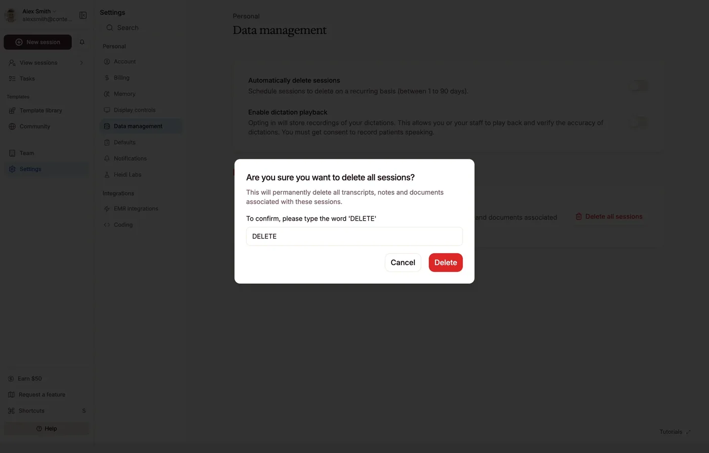
Strong, then a gapType-to-confirm deletion is handled with real care. It sits right next to permanent deletion with no recovery and an auto-delete setting. The care for the user’s data is real at one moment of the lifecycle, and the opportunity is to extend it to the next: recovery and version history.
-
Seams between teams
The throughlineEvery opportunity above lands at a boundary: auth, billing, integrations, the spaces between owners. Heidi is strong where one team holds a surface, and the seams are where the system could carry more. That is the natural next chapter for coherence as the company scales.
Where I'd start
- 01
Make the design system carry judgment, not just components. Tokens, patterns, and guardrails that make the coherent choice the default for everyone who ships, designers, PMs, and the model alike.
- 02
Own the seams. Bring auth, billing, and integrations into the system. The coherence opportunities live at the boundaries, so the boundaries are where the work is.
- 03
Strengthen patterns, not instances. The arrow and the in-flow upsell are symptoms. Resolve the hierarchy and the monetisation pattern once, and the instances take care of themselves.
This is the most honest measure of the role. Heidi is already most of the way to feeling like one person's work, which is rare and hard-won. Closing the last distance is not more taste applied screen by screen. It is taste encoded into a system, so the whole product can hold the line the core already holds. That is how taste scales.
The review
The detailed design review