01 · First impressions · Heidi web
First impressions
First impressions are where trust begins before the product has done any clinical work. A clinician is deciding whether Heidi feels safe enough, clear enough, and mature enough to bring into the room.
At a glance
Heidi has redesigned its homepage, and it is more ambitious and less clear. A concrete, human promise has become an open-ended prompt, a mode switcher that is hard to read, and a closing line that could belong to any health-tech company. The brand craft is intact. The opportunity is to put the old clarity back at the front, then let the breadth unfold.
A clinician's first impression of Heidi now begins on a freshly redesigned homepage, then a sign-up, then the first session in the app. I walked it top to bottom. The brand craft is still real and the type is still beautiful. What has slipped is the proposition underneath: the site is more ambitious and less clear than the one it replaced, and that clarity is worth getting back.
The homepage now opens in the deep end
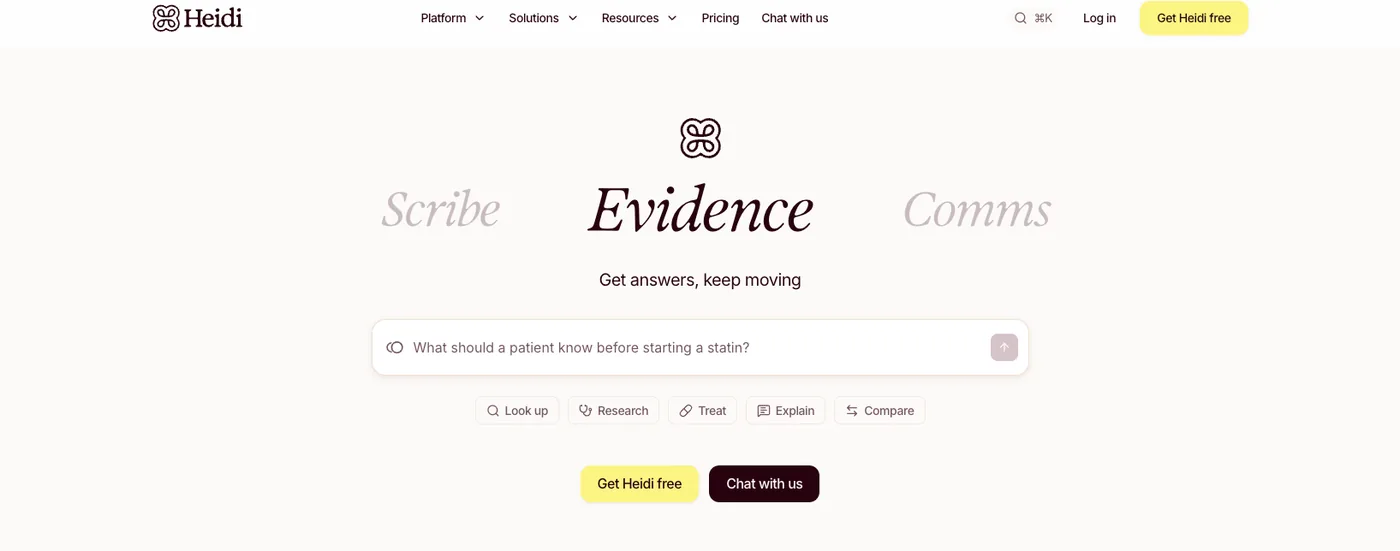
Heidi has redesigned its homepage, and the new hero opens on three rotating modes, Scribe, Evidence, and Comms, above an open prompt, What are we solving today?, with five action pills: Look up, Research, Treat, Explain, Compare. It is a confident bet on Heidi as a broad care partner rather than a scribe. It also asks a brand-new clinician to know what they want before the product has shown what it does. The homepage it replaced led with one human promise, Get time back. Move care forward., and that proposition was far stronger: concrete, outcome-led, and impossible to misread. The redesign trades that clarity for breadth, and drops a first-time visitor straight into the deep end.
- What works
- Ambitious, confident statement of the whole platform.
- The opportunity
- An open prompt asks clinicians to know what they want before Heidi has shown what it does.
- What I'd propose
- Lead with the one clearest promise the way the old homepage did, then let the breadth unfold. Get time back earned the click; What are we solving today assumes the clinician already knows. I'd open with the single strongest outcome and reveal Scribe, Evidence, and Comms as the clinician leans in.
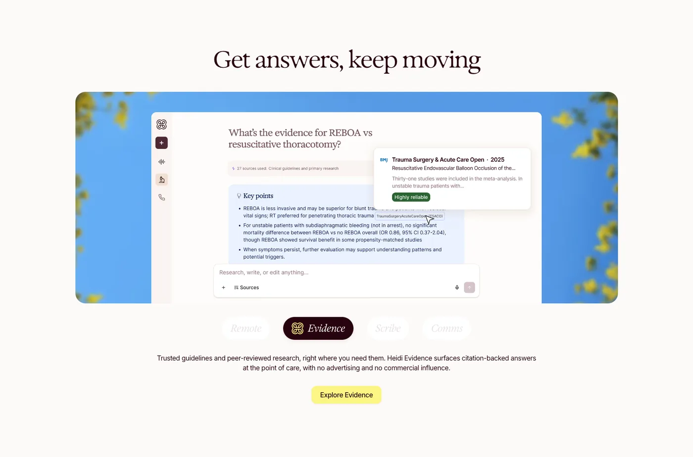
The mode switcher is hard to read
Below the hero, one component cycles through the four modes, Remote, Evidence, Scribe, and Comms, swapping the heading, image, and copy each time. The idea is good: show the breadth of the platform in a single place. The execution is not there yet. The active tab is a dark pill and the rest are ghosted, so it is hard to tell what is selected, what is clickable, and whether the panel is rotating on its own or waiting for me. Take your scribe wherever care happens is a strong line for Heidi Remote, but it arrives through a control that feels unfinished, and the jump between modes is abrupt rather than legible.
- What works
- One place to show the breadth of the platform.
- The opportunity
- A switcher with an unclear selected state, and no signal whether it auto-rotates or waits.
- What I'd propose
- Make the control honest about itself: a clear selected state, visible affordances, and a calm transition between modes. If it rotates on its own, show the progress; if it waits, invite the click. The breadth is worth showing, so the component carrying it should feel as finished as the note.
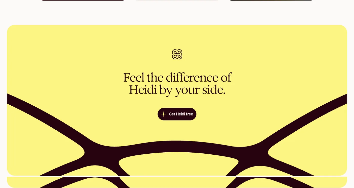
The closing line could belong to anyone
The page closes on a full-bleed panel, Feel the difference of Heidi by your side., above a single Get Heidi free button. It is beautifully set, and it says almost nothing. Feel the difference of what, exactly, and by your side how? It is the kind of warm, non-specific line that could sit on any health-tech homepage. The previous proposition was stronger because it named the outcome, time back and care forward, in words a clinician could picture. Closing on a feeling rather than a promise leaves the strongest piece of real estate on the page doing the least work.
- What works
- A confident, beautifully set brand moment.
- The opportunity
- A closing line so general it could belong to any health-tech company.
- What I'd propose
- Spend the closing panel on the promise, not a feeling. Name the outcome the way the old homepage did, and the button has something concrete to act on. A feeling is the reward for a clear proposition, not a substitute for one.
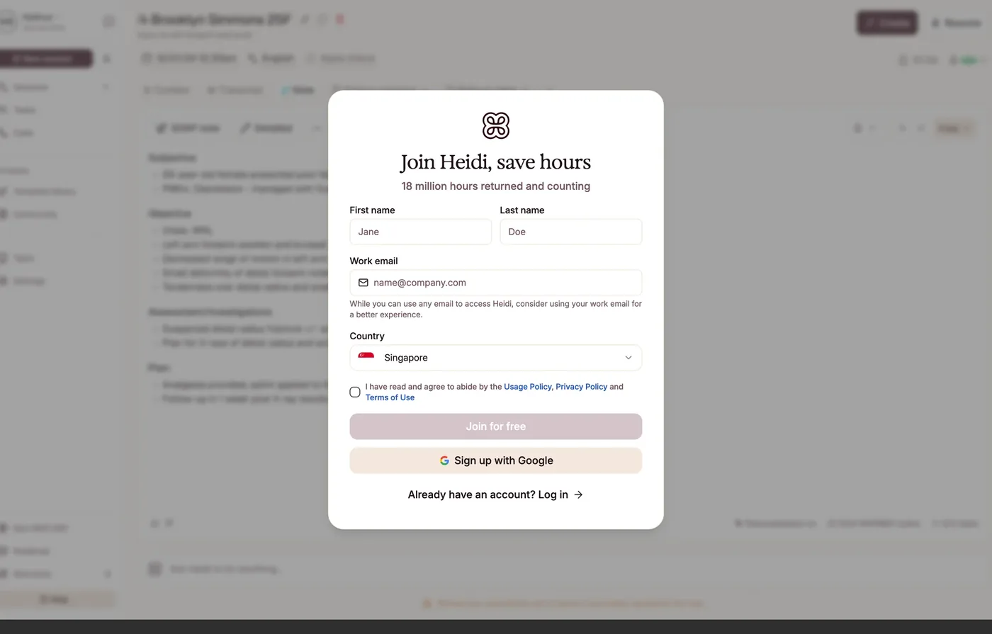
Sign-up shows the value, then hides the button
The sign-up modal floats over a blurred, fully populated note. It is a smart move: you see the product working before you commit, and the copy carries proof. But the primary action, Join for free, is a pale pink that reads as permanently disabled. Against the warm ground it has almost no contrast, so the one button you want pressed is the quietest thing on the screen, while Sign up with Google is darker and louder.
- What works
- Value-first, minimal fields.
- The opportunity
- Primary CTA contrast.
- What I'd propose
- Give the primary CTA a real enabled state in oxblood or forest, and make the disabled state unmistakably inert. The most important button should never be the faintest.
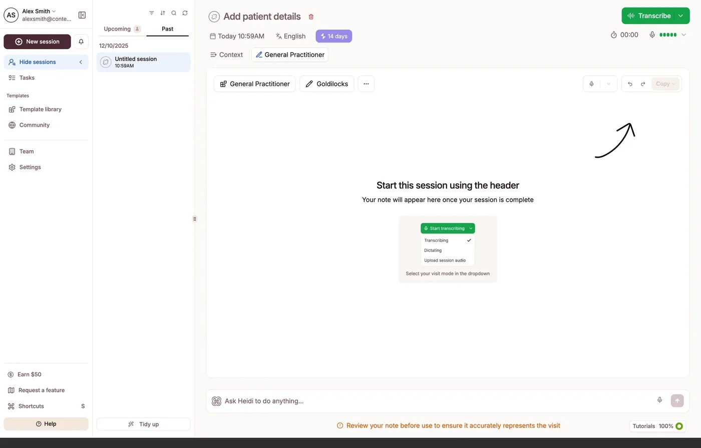
The first win arrives busy
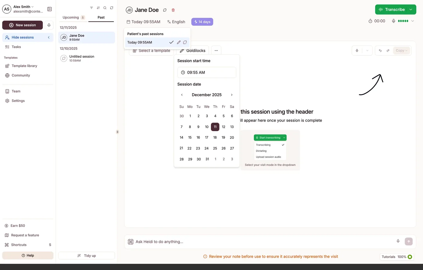
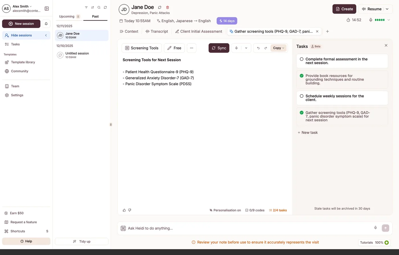
Arrival is the first session. Heidi guides you to Transcribe with an empty state and a hand-drawn arrow, a friendly nudge. But the canvas a brand-new user lands on is a dense three-column app: a left rail of eleven destinations, including Earn $50 and Request a feature, a session list, and the note canvas, all at once. The single thing that matters in minute one, start recording, competes with everything else, and the hand-drawn arrow is doing work the layout should be doing.
- What works
- Honest "review before use" disclaimer.
- The opportunity
- Full app density at the initial touchpoint.
- What I'd propose
- Defer the density. The first impression should foreground one action, record your first session, and reveal the rest as it becomes relevant. Earn the clinician's first win before showing them the whole building.
Where I'd start
- 01
Put the proposition back at the front. Lead with one clear, outcome-led promise, then reveal the breadth as the clinician leans in.
- 02
Finish the mode switcher. A clear selected state, visible affordances, and a calm transition; the breadth deserves a control as finished as the note.
- 03
Strengthen sign-up and sequence the first session. Make the primary action the loudest, and defer the app's density until there is something to manage.
The craft is all still here, in the type, the colour, the brand. What the redesign lost is the thing that made the old homepage work: a single, concrete promise a stretched clinician could grasp in seconds. From the outside I read this less as a misstep than as an opportunity, to put the proposition back at the front and let everything else follow from it.
The review
The detailed design review